
UrbanPulseThe city, in context.
I led the engineering on UrbanPulse alongside two teammates. We brought bike, weather and air data into one city view, with a way to trace every number back to its source.
Visit website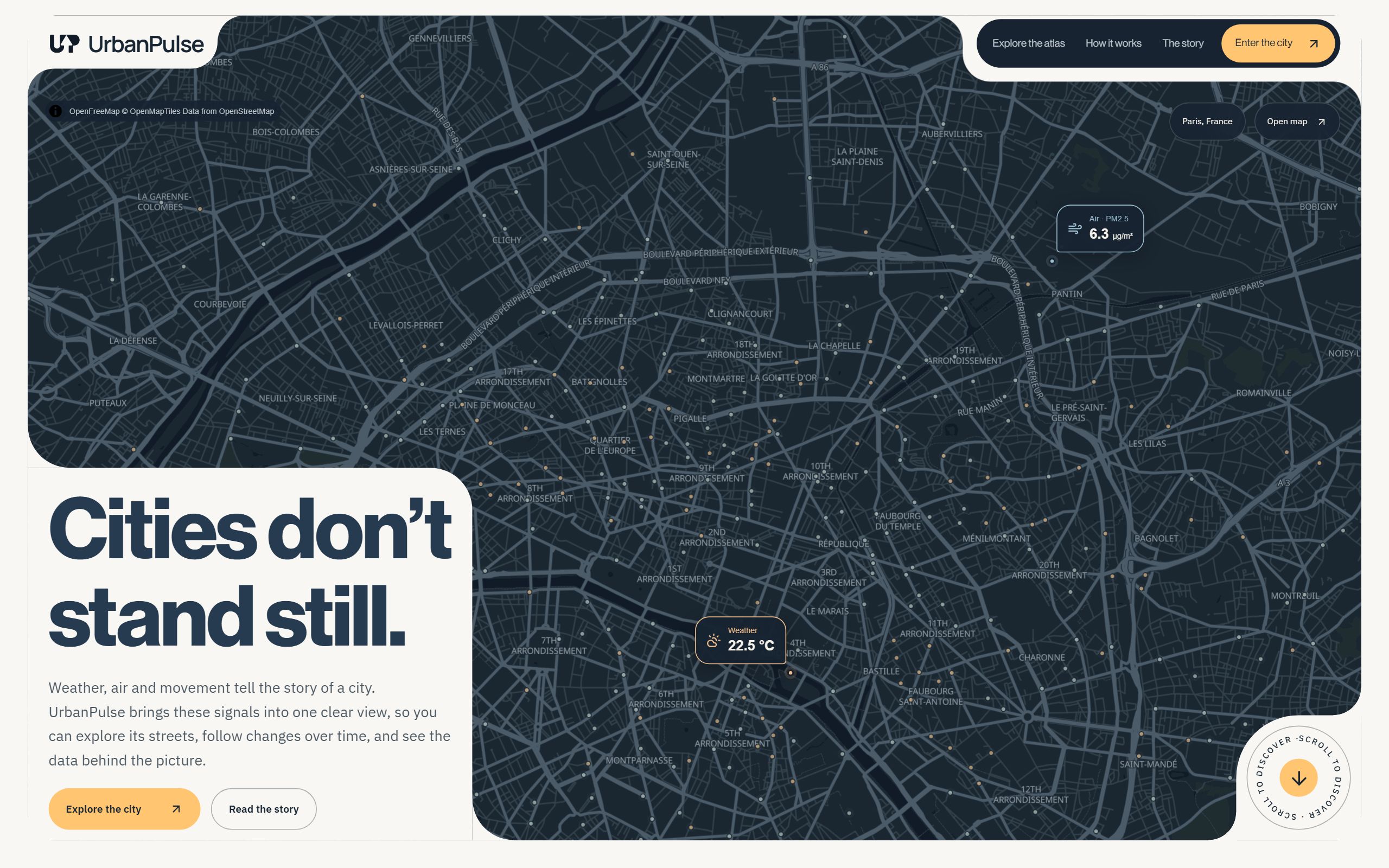
The Problem
Imagine opening three tabs to answer one question: what is changing in this part of the city? Bike stations, air readings and weather reports update on different clocks and describe places differently. Put their raw numbers side by side and the result can look precise while hiding those mismatches.
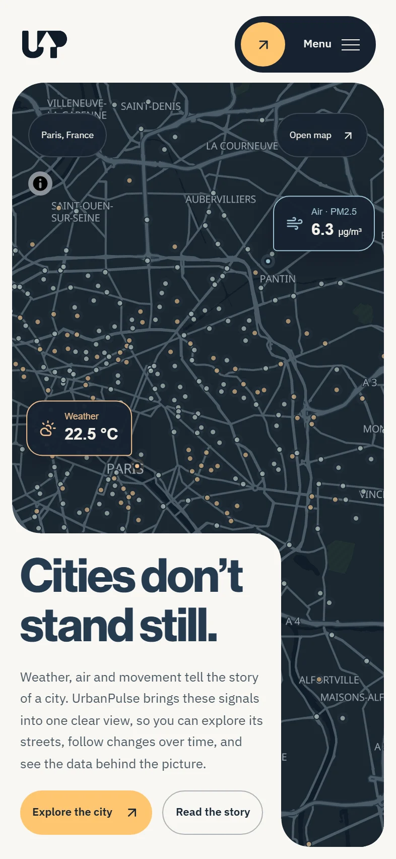
UrbanPulse gives those feeds a common shape before they reach the screen. We keep the original records, align time and location, and show the source and freshness beside each metric. Now you can explore a change and see how much to trust it.

How we made the numbers agree.
We do the untangling before the browser sees the data. Python keeps the original responses; PostgreSQL and PostGIS give them a shared spatial model; dbt checks the results; and FastAPI serves the small answers the city view needs.
- 01
Collect
Weather, air and bike feeds
Public APIs - 02
Keep the source
Raw history stays inspectable
Python + PostgreSQL - 03
Find a common shape
Spatial models and quality checks
PostGIS + dbt - 04
Show the answer
Small, focused city views
FastAPI
Explore the city view.
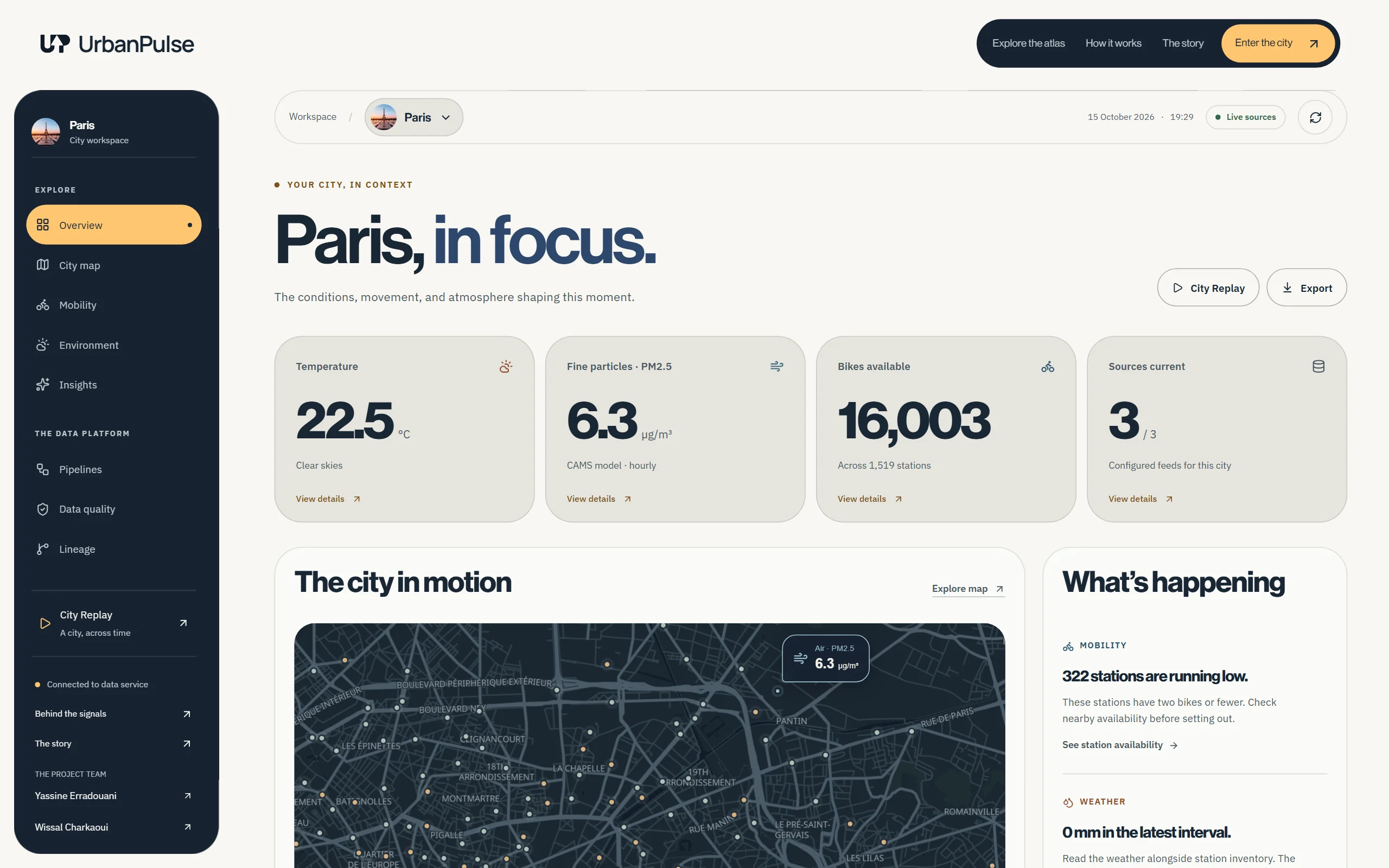
The overview answers what is happening; the map helps you see where. Switch between them to explore the same Paris snapshot from two angles.
What changed while you were away?
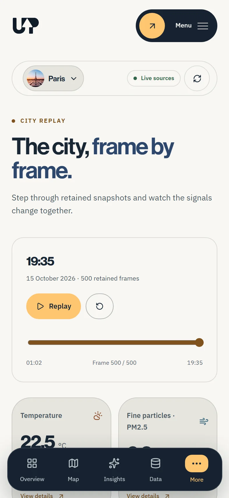
City Replay keeps earlier snapshots available to inspect. Its timeline shows how bike availability, modeled air conditions and weather changed, with the time of each observation kept alongside the values.
Can we trust this number?
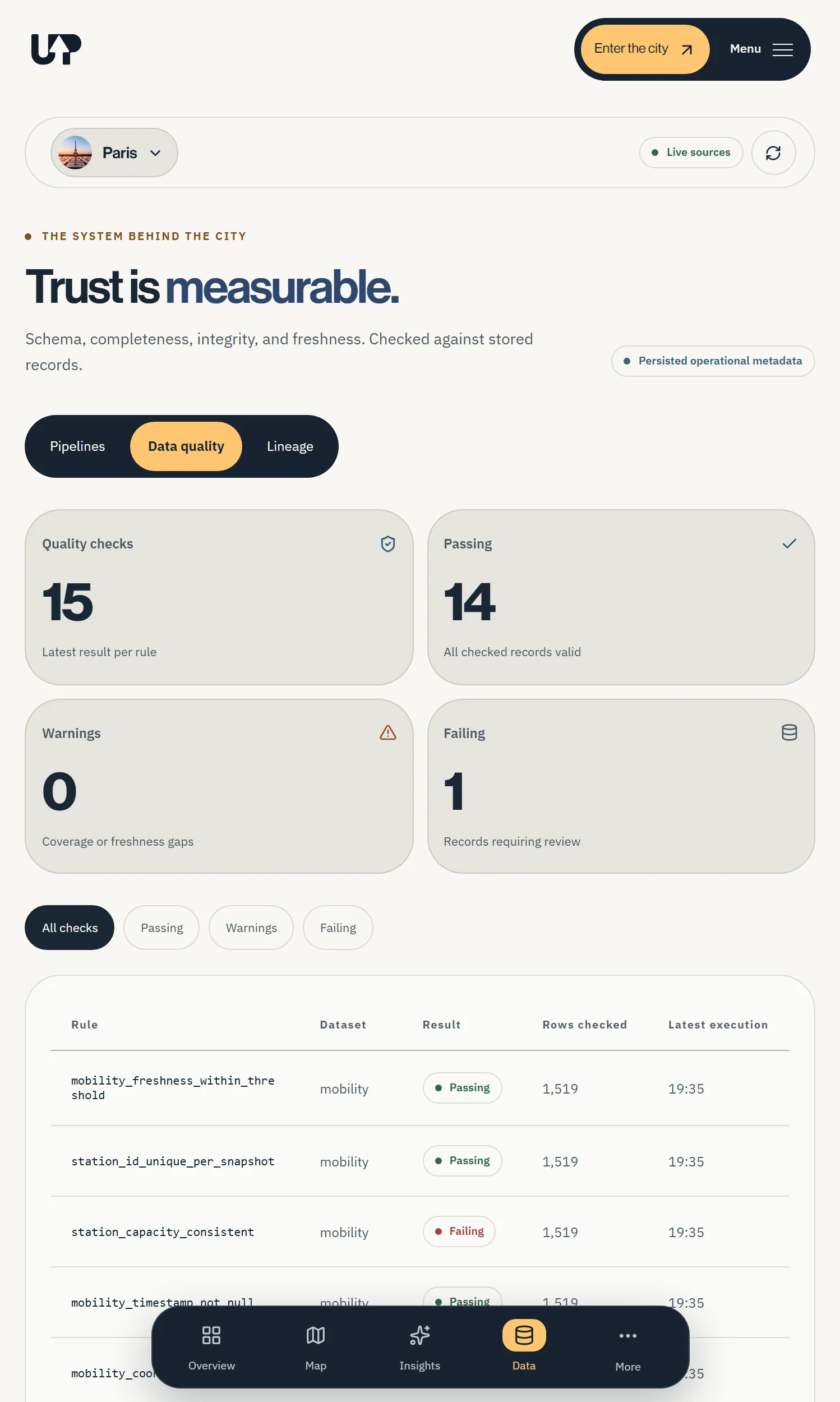
A successful pipeline does not guarantee good data. The quality view shows the result of each rule, the dataset it checked and when it ran. Failing checks stay visible, so you can investigate a number before relying on it.
Why these three feeds?
Continue readingIs there a bike nearby?
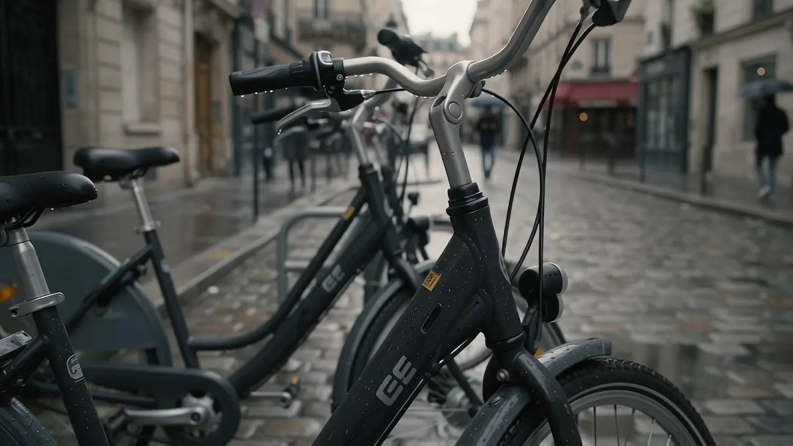
Start with the station map: available bikes, free docks and the time of the last update. A count is only useful if you know where and when it was recorded.
What are the conditions?
Temperature, rain and wind add context to a trip. UrbanPulse brings the weather snapshot alongside the bike stations, so you can check both in one view.
What does the air reading cover?
The Paris air values are modeled for an area. They describe broader conditions, not a sensor on this street. The source and its coverage belong beside the number.
Illustrative city scene
Scroll to explore
The useful part is context.
UrbanPulse is live, collecting public weather, modeled air and bike station data. The path from the source to the screen stays inspectable, because a useful metric should come with an explanation.
Read the build story